Palettes in terminals: why gamma is a problem
Tags: terminal interface color portability libuncursed | Written by Alex Smith, 2017-12-18
It's relatively rare that there are large disagreements among NetHack 4 developers. Occasionally, though, things get quite heated. You might notice that NetHack 4 provides a very large number of preset palette options; this is fallout from an argument we had a while ago, about what palette NetHack 4 should use for text-based play.
There are plenty of considerations that go into making a palette, but a relatively important one for roguelikes is readability: the ability to determine what color something is quickly and easily by looking at it. NetHack uses a total of 15 or 16 colors (sometimes dark grey is unusable due to a lack of support from the terminal), and although it has a farlook command (;, or in the case of NetHack 4, mouse hover) that allows color-blind people and those without color terminals to get the information they need without color cues, the game is much more playable if it's possible to determine what something is without farlooking it. As such, you want to ensure that all the colors are distinct from each other, which is nontrivial because there are (16×15/2) = 120 different color pairs, each of which have to be as easily distinguishable as possible. (In practice, it may be as many as 240, because sometimes it's easier to see a letter of one color on a background of another color than vice versa; or considerably fewer, because most games don't use the full range of background colors (NetHack 4 uses six, for 90 relevant pairs).)
The disagreement in question was quite bewildering for everyone involved. We put a lot of effort into creating palettes that we felt were appropriate and as readable as possible, suggested them, and got complaints from other developers that the palette was completely unreadable! Some of the palettes suggested by other developers looked to me like they contained black and a bunch of hard-to-distinguish pastels, whereas many people were complaining that my palettes were unreadably dark. At the time, I perhaps naively assumed that this was just down to people's personal preferences, but it turns out that there's actually a reason for this, and a fairly convoluted one. A very quick summary is "it's all to do with gamma", but it's worth looking at what the situation is, how it came about, and what we might be able to do to fix it.
Gamma encoding of images
Most programmers think of color as having three components (redness, greenness, and blueness), measured in a range from the minimum to the maximum possible value that the screen can cope with (normally either as a real number in the 0..1 range, or as an integer in the range 0..255). However, although this is a simple definition that makes sense for most screens, it's missing an important detail: if 0 is the darkest possible color for a given component, and 1 is the lightest possible color, then what does 0.5 mean? The obvious conclusion is "it's halfway between 0 and 1", but it turns out not to be that easy in practice.
One issue that's often seen is that screens have a nonlinear color response. An old-fashioned cathode ray screen produces light that becomes more luminant when you feed more voltage to the electron gun; however, doubling the voltage doesn't double the luminance (the exact relationship is more complex than that). A related issue is due to human perception: humans are better at distinguishing dark colors than light colors, so if you shine twice as much light on the human eye, it will look less than twice as light. (Technically, we talk about luminance, the amount of light falling on a given region of area such as the eye's pupil; and lightness, how light or otherwise the color actually looks to a human.) Similarly, cameras have a similar issue, with the amount of lightness perceived by the camera not actually being proportional to the amount of luminance entering it.
On the other hand, when using a limited range for color components, such as 0 to 255, it's useful to have all parts of the scale being equally useful; if 1 and 2 look very different but 253 and 254 are indistinguishable, then the color coding you're using is inefficient (you might as well represent 253 and 254 by the same number in order to fit in an extra color between 1 and 2). As such, it's usual for an image to be encoded in a nonlinear way, so that each of the possible values for a color component is approximately equal. This means that when values are being written to or read from an image, there's a form of correction to the color components going on that, just like the examples above, is nonlinear.
It turns out that all these different color response curves (screen response, human perception, and image encoding) have similar formulas. Although not exactly correct, it's common to represent the formula for each of these as follows, where o is the output and i the input:
o = iγ
with the output and input expressed on a range from 0 for the minimum, to 1 for the maximum, and where γ is a constant ("gamma"). The resulting formula is close enough to the actual color response to be practically useful (and was the one that was typically actually used in practice until quite recently, and is still often used as a fallback nowadays). As such, this is the formula that I'll be talking about in this blog post (and that I recommend you use in your own programs unless you're doing something that very heavily depends on a perfect color response, which is rare in roguelike development).
Now, this formula has a very useful property: suppose that a color goes through a number of different conversions (whether that's storing it in a file, displaying it on a screen, perceiving it with a human retina, or something else along those lines). Let's assume that each of the conversions obeys the formula above. If we combine two consecutive conversions, we get the following formula:
o = (iγ₁)γ₂ = i(γ₁γ₂)
which has the same form as the original formula. In other words, we can use the formula above for not only a single conversion, but to summarise a whole sequence of conversions (simply by multiplying together the values of γ).
We can see, therefore, that in order to understand a color, there are actually four relevant pieces of information. We have the redness, greenness, and blueness, but we also need to know what units they're in from a gamma point of view, i.e. we need to know what value of γ the image "expects" to exist between the numbers that exist in the color, and the final amount of perceived color going down the optic nerve after the image is seen by a human. Without knowing γ, it's impossible to know how relatively light two colors in the image are meant to be perceived as; for example, is a 200 in the image meant to be perceived as twice as light as a 100 (e.g. because the numbers are on the scale used by human perception), or less than that (e.g. because the numbers are on the scale of luminance)?
How computers determine γ
It can be seen from the above discussion that the value of γ used to encode an image doesn't hugely matter (it has some impact on how many of the values for any given channel are useful, so it can reduce the number of bits per pixel required for a given quality, but this is a comparatively minor effect unless the value is really extreme). So what's really important about gamma is not the value, but that the value is known; it'll always be possible to re-encode an image to use a different gamma mathematically. This means that gamma correction has traditionally been dealt with via simply picking a value and then encoding all images to use that value.
Unfortunately, it tends not to end up that simple in practice. One issue is that a computer typically doesn't know what the viewing conditions will be like after it's sent the signal to the screen. A computer can guess that a cathode-ray screen will apply a gamma correction of about 2.2 (due to the physics of how a cathode-ray screen works), so it can compensate for that, and it can obviously compensate for all the software aspects of gamma, but it can't really compensate for the response of the human eye without knowing how bright the screen will be, how well-lit the room will be, and so on. As a consequence, gamma specifications tend to only take into account the gamma correction as far as the light coming out of the screen itself, without including the details of the correction required for human perception (which is just as important, in an image designed to be seen by humans!).
There's a followup problem with this. Cathode-ray screens used to be pretty much the only sort of screen anyone used, but nowadays, liquid crystal displays are more common (with a range of other screen types in use), and as different types of screen are based on different physics, they have different gamma responses. For backwards compatibility, these newer screen designs typically use an artificial gamma circuit to "pretend to be" a CRT (and thus introduce a total gamma correction of 2.2 between their input and the luminance being output), but there are unfortunate limits to this: a liquid crystal display's gamma actually depends on viewing angle, something which it's very hard for the screen to control for (and most screens don't even try).
Another problem is that when people encode an image to a fixed gamma, they often neglect to list what that gamma is. That would be fine if there were only one gamma correction value in common use, but as is unfortunately often the case with standards, there isn't; there are three fairly common values, with 1.0 (i.e. the image just specifies luminance and leaves it up to the image reading software to convert that into units the screen understands), 1/1.8 (used by many older Apple systems), and 1/2.2 (i.e. the image expects its levels to be directly modified by a CRT) all being frequently seen; the number listed here is the correction that's already been applied to the image (i.e. 1 divided by the amount of correction the image expects to exist in the rest of the pipeline). Most modern image standards do allow an image to specify the gamma it's encoded to, but this is only of limited use, because often the image processing program that wrote out the file has no idea what gamma the file was encoded for and has to either guess or leave it out. (Incidentally, Photoshop, one of the best-known image editors, has been caught generating nonsensical/corrupted gamma-ramp specifications, which cannot possibly be correct, in the past; this problem has ended up affecting the raw files behind one of the tilesets used by NetHack 4. I don't know whether the problem has since been fixed or not.)
So with all this doubt about what the values in an image or in a color actually mean, what can we do? The answer is to do the same as I always do, and try to determine it experimentally. After all, this makes it possible to compensate for all the gamma conversions along the way (even those introduced by the human eye, if a human is doing the testing), because no matter what gamma conversions are actually happening, they all multiply together into a single number, and we can determine what that is. Once the desired gamma correction for any particular setup is known, we can put that in at any desired stage of the pipeline and people will end up seeing the expected colors (maybe not perfectly – gamma is an approximation – but good enough for the typical computer game).
Gamma test images
In order to try to work out what's going on with gamma, I've created a test image. This consists of a number of columns; each column starts by taking a range of 11 equally-spaced greys between black and white, and then applies an arbitrary gamma correction to it (a different arbitrary correction for each column). Here are three copies of the test image:


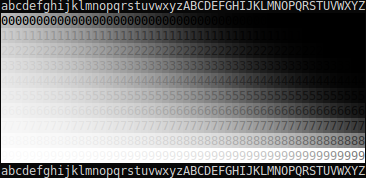
(Note that if you want to test an image-displaying program other than a Web browser, you can just download the image and open it in the program.)
In order to use the test image, start by scrolling it to the place on the screen that you most commonly look at / position your game window when playing games (so that the viewing angle will be as accurate as possible). Then look for the column in which the greys are, to your perception, most evenly spaced. In order to make it easier to work this out, the greys are arranged as the foreground and background colors of the numbers from 0 to 9; the more different two consecutive colors are, the easier it will be to read the number. So when the greys are evenly spaced (i.e. the arbitrary gamma correction on the column exactly compensates for all the gamma corrections between the image and your optic nerve), all ten numbers will be approximately equally easy to read. (It's possible that the numbers can never quite be evenly spaced as a consequence of rounding errors – this is 24-bit color and thus only has 256 shades of grey, which are not enough – but it should nonetheless be accurate enough to get an idea of which column is which.)
Once you know which column compensates best for the gamma, you can simply read the total value of γ that was used to encode that column (i.e. that exactly compensates for the gamma conversions that happen between the image and your optic nerve) off the following chart:
a=0.135,b=0.146,c=0.158,d=0.170,e=0.184,f=0.199,g=0.215,h=0.232,i=0.250,j=0.270,k=0.292,l=0.315,m=0.340,n=0.368,o=0.397,p=0.429,q=0.463,r=0.500,s=0.540,t=0.583,u=0.630,v=0.681,w=0.735,x=0.794,y=0.857,z=0.926,A=1.000,B=1.080,C=1.166,D=1.260,E=1.360,F=1.469,G=1.587,H=1.714,I=1.851,J=1.999,K=2.159,L=2.332,M=2.518,N=2.720,O=2.937,P=3.172,Q=3.426,R=3.700,S=3.996,T=4.316,U=4.661,V=5.034,W=5.437,X=5.871,Y=6.341,Z=6.848
When I try this test in Firefox or Chromium on my own laptop, I see
even spacing in approximately column A or perhaps B on the second
and third copies of the test image (i.e. the various software-induced
gamma corrections are all approximately cancelling each other out and
so I perceive lightness as almost proportional to the actual number
shown in the color channels of the image). On the first copy, no
column is particularly even (due to rounding errors), but the most
even for me is somewhere around column L, so most likely a gamma
correction of somewhere around 1/2.3 is being applied between the
image and my optic nerve.
So why do the images look different (on Firefox and Chromium, at least?). The images are exact copies and contain the exact same pixels, in the sense that each pixel is encoded with the same amount of redness, greenness, and blueness. The only difference is in the image metadata, which indicates what format the image is in. The first image claims to have been encoded for a gamma of 1.0; the third for 2.2 (i.e. expecting a gamma of 2.2 to be applied later in the pipeline). The central image claims to have been encoded for an unknown gamma (i.e. I intentionally left out any specification of what the color channel values are supposed to mean when I made it, meaning that the browser has to fall back on default values or a guess).
We can see, therefore, that on my computer, something is apparently
wrong with the general "gamma pipeline". According to the standards,
the first image should have produced a linear output in the amount of
luminance emitted from the screen in column A (that's what "encoded
for a gamma of 1.0") means. Likewise, the third image should have had
a correction of 2.2 applied by something (perhaps the screen), which
should produce a linear output in column p or q. I'm perceiving
lightnesses that are brighter by a gamma of around 1/2.3 (bear in mind
that gammas below 1 make an image brighter) from the luminances that
should be output; a human eye has approximately γ = 1/3, so there's
about γ = 1.3 of unexplained conversions going on here, meaning that
it's quite likely that my screen is misconfigured. Incidentally, the
results from the second image shows that the browser is assuming an
image is encoded with a gamma of 1/2.2 in the case where the image
format is unknown (because it produces the same results as the image
that explicitly states it's using a gamma encoding of 1/2.2).
Is a misconfigured gamma plausible? Well, seeing as I can see palettes with lots of dark colors easily but can hardly distinguish the bright ones, and several other NetHack 4 developers reported the exact opposite with the same palettes, it's quite likely that my laptop is treating colors differently from most. I may need to try to correct that once I've finished writing this blog post.
Another NetHack 4 developer reported that the most uniform column for
them was in the w-x range; with the image encoded to 1/2.2, the
luminances that a correctly configured screen would output in that
column would be converted by a total gamma of about 2.9 (2.2 to
compensate for the image, divided by around 0.76 from encoding of the
column itself), which after taking into account the approximately γ =
1/3 expected of human vision, would exactly match up to a perceived
gradient of even lightness. This is heartening; it means that at
least some systems do seem to handle gamma exactly as advertised.
Gamma and terminals
As shown above, even gamma for images in a web browser, a relatively explored area of color correction, is something that can go wrong on modern systems. That's despite the fact that images can specify what gamma standard they're using and the fact that browsers have gamma correction code.
So what about the original problem that set me looking at all this, palettes in terminals? Not all terminals support specifying custom colors beyond the standard eight (and slightly less standard other eight, making a total of 16 standard-ish colors) at all, but for the ones that do, there are generally two ways to do it: paletted color, in which a set of colors is defined and then used; and truecolor, in which colors are used directly.
Truecolor
Truecolor is the simpler case implementation-wise, although with an interesting historical quirk. The vast majority of terminal codes are specified in Ecma-48 (it was also adopted as ISO/IEC 6429, but ECMA give out specifications of their standards for free and ISO doesn't, so ECMA's a better source in this case). However, there's one interesting gap in the standard; the codes for setting colors beyond the normal 8, SGR 38 and 48, are defined as "reserved for future standardisation", with a reference to ISO 8613-6 / ITU T.416. These are the same standard, which is better known as Open Document Architecture (here's the Wikipedia page about it, for the benefit of people who are interested in the background).
Open Document Architecture (ODA) was basically an early attempt at something like HTML (most famously used by the World Wide Web, but also used for documents sometimes), or like OpenDocument (the ".odt" file format that's ubiquitous in word processors nowadays); although it had quite some momentum at the time, this was back in 1985 (slightly before even NetHack came about, and well before HTML was created in 1993). The aim was to produce a single inter-operable format that could be used by all word processing programs (which were typically incompatible at the time). Although a worthy aim, and one that has proven to be worth aiming for, there were various problems with that early first attempt at achieving it; the standard ended up taking 14 years to write, and by the time it was finally released in 1999, it was much too late for it to really make much of a difference, and the standard has now fallen into obscurity.
Anyway, part of the reason ODA took so long to write, and/or that it
failed to catch on, may well have been the slightly odd markup
language it used. Nowadays, a standard of this nature would probably
use XML or at least SGML, but those hadn't been invented yet, so ODA
instead drew on a medium which would have been well-known by
programmers at the time: terminal control codes. On a terminal, you
specify bold text using SGR 1 (or as a sequence of bytes, ESC
[ 1 m.) In ODA, bold text is, at the lowest level,
expressed using precisely the same sequence of bytes. So although a
word processor is rather different in nature from a terminal, they
have enough in common for the standards to be able to steal ideas and
control codes from each other. (Incidentally, there's something
faintly mind-blowing about there having been around 14 years of effort
spent on attempting to implement HTML using terminal control codes.)
Ecma-48 is fairly comprehensive, covering most of the codes that might be of use to a terminal (and many that turned out not to be). ODA, on the other hand, needed to be able to express anything a word processor might want to express, making it much more than merely fairly comprehensive; as such, it needed to introduce codes for things like (relevantly here) colors beyond the standard ones. It introduced a range of codes starting with CSI 38 (for foreground) and CSI 48 (for background). The typical code that terminal developers describe as "truecolor" is described by ODA as "direct color in RGB space". Here's what the code looks like in ODA:
ESC [ 38 ; 2 : colorspace : redness : greenness : blueness m
Note the colorspace argument here. Presumably, this would have been used to specify the scale on which the red, green, and blue components were measured, both in terms of range and gamma (I expect this information exists in the ODA standard somewhere but it's so long it might be hard to find; if you know how colorspaces work in ODA, please let me know!); the standard mentions that it "may contain … the scale and offset", which is not on a literal reading the same as gamma, but doesn't seem very sure about it. Interestingly, it also has optional support for extra parameters that specify how much approximation the printer is allowed to do when choosing an appropriate color.
Unfortunately, when terminals started adding support for truecolor, they made a few changes to the original ODA code:
ESC [ 38 ; 2 ; redness ; greenness ; blueness m
One change here is that the rather eclectic mix of semicolons and
colons ended up changing to all-semicolons, presumably out of habit
(colons are rarely used in Ecma-48 code and semicolons are
everywhere). This was an unfortunate misreading, and lead to some
fairly nasty ambiguities that cause codes to be misinterpreted on
older terminals (in addition to the fact that optional parameters now
can't be given at all, as they'd cause the grammar as a whole to
become ambiguous; you can chain multiple different subcommands inside
an SGR command, i.e. ESC [ … m, via separating them
with semicolons, and that'd contradict the use of semicolons here).
Some terminals have since tried to fix this by providing all-colons as
an alternative, but a) that still doesn't match the standard (although
it's probably better than the original from a technical merit point of
view), b) many older terminals seem to echo things after a colon,
rather than parsing it as though it were a digit (Ecma-48 implies that
terminal parsers should treat an unexpected colon like an unexpected
digit, but not all terminals seem to have got the message). Oh well.
However, the other change, and one that's more serious from a gamma point of view, is that the colorspace parameter has been dropped. Presumably, this is because unlike word processor documents, terminals don't have a document profile with a set of color space definitions. Unfortunately, the parameter wasn't replaced with anything, and nor was the meaning of the redness/greenness/blueness parameters actually defined (although most terminals seem to assume that the range is 0 to 255, something that ODA doesn't specify). So different terminals can legitimately interpret these parameters different ways. Most likely, they're just going to send them to the operating system, X11 server, or the like without specifying what they mean, and so it's up to the graphics drivers to decide on their meaning.
There's fairly strong evidence at this point that different hardware/software setups do in fact interpret the numbers in different ways from each other; two (red, green, blue) triples that lead to easily distinguishable colors when used on one setup can be almost indistinguishable on another. This is what ended up causing the heated argument among NetHack 4 developers listed in the introduction; we were each thinking that the others' color/palette preferences were utterly bizarre and unusable, when in fact, we were just seeing entirely different colors. And of course, screenshots didn't help at all (because they typically had unspecified gamma, and so had exactly the same rendering issues as the original terminals did). Come the time when people tried to share suggested palettes for use as a default, and things got fairly bad.
So how do we fix this problem? In almost every case (see the discussion of xterm below), we can't do it using the codes used by current terminals, because existing uses of those codes are in inconsistent units with each other and don't specify. Instead, I'd like to propose that terminal designers use the ODA arrangement of semicolons and colons to specify an RGB color with gamma adjustment:
ESC [ 38 ; 2 : gamma : redness : greenness : blueness m
This code a) has more standards-compliance than the existing codes, b)
is totally unambiguous with respect to existing terminal codes (as no
SGR parameter string designed for the terminals I've tested contains
the substring 38;2:), and c) is unambiguous in terms of what the
color components mean (assuming a minimum of 0 and a maximum of 255,
as usual).
Of course, we need to define what the gamma parameter actually means. For simplicity (and because we need to make some arbitrary choice), and to avoid explosion of standards, I propose that it's defined the same way as in the PNG standard: the value is an integer which, when divided by 100000 (one hundred thousand), produces the value of γ which the image is encoded to, i.e. which the image expects to be compensated for in the remaining conversions between the values in the color channels and the resulting luminance of the colors onscreen. For example, a value of 45455 (one of the most common in practically seen PNG images, as it both leads to very simple hardware and a good range of usable channel values) means that the image is encoded to γ=1/2.2, i.e. that the color channels can be used as-is only if the amount of gamma in the conversions that will be applied between the image and the onscreen luminance happens to equal 2.2 exactly. If the color pipeline happens to handle gamma some other way than the terminal code is expecting, the terminal should adapt the displayed color to compensate; for example, if the gamma argument is 100000, the terminal should adapt the values it sends to the screen such that the value of the color channel is proportional to the amount of luminance emitted by the screen. These are identical operations to the ones that should be (but typically aren't) applied when reading a PNG image.
Note that this isn't quite as ideal as it could be; it takes into account all the parts of color perception that the computer software and hardware have control over, but not the color perception of the human viewer (which is a gamma conversion from luminance in its own right, and quite a large one; experiments have shown it to be somewhere around γ=1/3, except for very dark colors). I'd suggest that the best thing to do here is to choose colors that look good to a typical human, as most people aren't going to want to sit through an eye test to be able to play your game anyway; for example, if you want the lightness perceived by a human to be proportional to the numbers stored in the channels, a gamma parameter of 33333 would make sense. People who are interested in getting colors exactly right can work out how their own personal gamma differs from that of the average person, and add an extra gamma adjustment in their terminal or operating system to compensate for the difference.
Paletted color
For paletted color, in all terminals I've tested, the format used to specify a palette color is either as individual red/green/blue channels, or else as an X11 color code. As an example of the first case, we'll look at the Linux fbcon code (which is used by a few other terminals as well), which is very simple:
ESC ] P index redness greenness blueness
The three color channels here are specified as two hexadecimal digits, the index as one. One thing that can be noted about this code is that it hugely violates Ecma-48 (and in fact will lead terminals that don't understand it to wait forever for a terminating ST character that never comes; whenever libuncursed sends this code, it sends a "useless" ST afterwards in the hope of preventing terminals locking up). Another thing that can be noted is that this code is not extensible; it inherently assumes that only 16 colors exist, meaning that it's useful for setting up a palette of distinct colors but not very useful for simulating truecolor. (Actually, fbcon has a bug/feature in which changing the palette does not change the colors currently onscreen, so you can simulate truecolor with it via frequent palette changes, but this is obviously unreliable on a large scale.) And finally, we observe the major problem discussed in this blog post: there's no indication of how the color channels are encoded, just that they have a range 0-255. I would not recommend that any terminal designers use this code as the primary means of setting the palette (supporting it for backwards compatibility is just about viable, but not really anything else).
Terminals which have settable palettes tend to fall into two groups in terms of the sorts of code they use. One group is the fbcon code, as discussed there. For an example of the other typically used sort of code, I'll look at the way you set a palette entry in gnome-terminal:
ESC ] 4 ; index ; r g b : redness / greenness / blueness ESC \
This has several advantages over the fbcon code. For one thing, it
allows an arbitrary number of digits for the index (in decimal) and
color channels (in hexadecimal), meaning that there's no limit to the
accuracy of the colors or the number of palette entries that can
conceptually be managed (and in fact, gnome-terminal makes it possible
to set a 256-color palette if you want to). The ESC \ at the end is
also a valid encoding of the ST character (and the only one that's
unambiguous if you don't know what character set is in use), so
Ecma-48 is just fine with this. However, it's still suffering from
the gamma encoding being unspecified. (And it is genuinely
unspecified; the color in question is converted to a deprecated sort
of GTK color value that doesn't specify how values between minimum and
maximum are encoded; the non-deprecated equivalent is defined as
"working like in Cairo", but Cairo doesn't define how values between
minimum and maximum are encoded either. This sort of thing is the
reason why people just work on a "total gamma response of an entire
software/hardware system"; it's at least easy to calculate
empirically, and the evidence is that almost nobody is tracking it
explicitly.)
There's something here that might make you suspicious, though; what's
up with the hard-coded rgb: in the terminal control string? Now,
gnome-terminal actually supports another format (omitting the slashes
and using # rather than rgb:), but that's deprecated and so isn't
really what we care about here. What's more interesting is the
"etymology" of this code. The code originally comes from xterm, and
the reason why the rgb: is there is because gnome-terminal's color
parser is trying to emulate the behaviour of an old version of the X11
function XParseColor.
So what happens if we do the same thing in xterm? The typical palette
set code is identical to what was listed above from a user's point of
view, but it's now parsed using X11's XParseColor itself. And now,
for the first time in this whole section about terminals, we actually
now have a specification of what values between the minimum and
maximum mean! Unfortunately, it's one of the least portable possible:
the values shown are defined to be those requested by the interface
used by the cable going to the screen ("device-dependent color"),
which although being well-defined, is not actually all that useful, as
a terminal-based program that's maybe communicating over ssh or the
like can't be assumed to know the physical properties of the screen in
use. (In the olden days when all the world was a CRT, that would have
actually let you make a pretty good guess at the gamma; you'd encode
to a gamma of 1/2.2 from the output luminance you wanted. Nowadays,
with screens varying much more than they used to, this seems less
likely to work, although given that many screens pretend to be a CRT
it might at least be worth a try.)
However, the color space in use (here, device-dependent color) is
being specified by the rgb:. In modern versions of X11, nothing's
forcing us to use such an awkward color space. Why not pick one of
the other ones instead? XParseColor has a range of possible color
spaces available, including some designed for modelling colors as
perceived by humans. If we specified colors using one of those, then
it'd be the responsibility of X11 to work out how to encode that so
that it'd be perceived as requested.
Now, an obvious followup question is "how well does this work in practice?". The answer is "not very well". The first problem is that this color handling behaviour seems to be too new to be widely supported; I don't know when it was added, but checking a selection of X11-based systems has shown that many of them don't understand the color spaces in question at all. The second problem is that even for X11 servers that understand the syntax, they don't necessarily have any idea what the correct color response is either, and may need to assume a default value; my X11 server happens to give values very close to correct according to my perception when using CIELUV as the color space, but that might just be a coincidence (given that there seems to be a gamma correction of 3 from raw RGB, maybe it's not correcting at all). Finally, and perhaps most importantly, there seem to be bugs involved; for example, when using the CIEL*a*b* color space, the color suddenly gets much lighter if the lightness happens to be below 8% (i.e. 8% is about as dark as it goes, and 7.99% is much lighter by comparison), which is just bizarre. So something like this isn't really ready for widespread use yet. Perhaps in a few years.
One advantage it does have, though, is that if you send xterm colors using a device-independent colorspace, if you then read them back from xterm, you get the values as RGB. This is very helpful in that it gives a more or less foolproof algorithm for determining if the syntax is understood and working correctly; there's almost no way that a terminal that doesn't understand it would randomly end up coming up with plausible-looking responses to a query like that.
Advice for handling color in terminals
So with the state of terminals as it is, how can programs ensure that the colors that they send are interpreted correctly? The answer seems to be that, in general, they can't, but there are a few steps that can be taken:
First make sure you understand yourself what colors you're using. Specifying a color as RGB in device colorspace, or (even worse) red/green/blue with unspecified meanings for the channels, means that you've failed before you've even started. At a minimum, work out (e.g. via use of gamma test images) what gamma your colors are being interpreted as, and record that along with the RGB components so that you can compensate for it later once you get a different computer, screen, operating system, or the like.
Gamma is compositional; you can do a gamma correction at any point in the process of displaying a color or image, and have a known effect on the final outcome. As such, a simple numerical setting for a gamma correction that your program should apply itself, defaulting to 1 (i.e. no correction), makes it possible for users who know what they're doing to fix gamma-related problems via telling your program to do the correction.
If you're using a library that allows you to tell it what gamma encoding you're using for colors, tell it! Likewise, if the library's documentation specifies a particular gamma encoding that it wants to see, convert to that encoding! Being able to push the problems with dealing with gamma off onto someone else is a) very convenient and b) necessary if you ever want things to work automatically on a wide range of systems.
If you want to specify lightness (i.e. color as perceived by a human; you probably do), but are using a library in which you specify luminance (i.e. color as perceived via an objective measurement), producing color that's darker by a gamma of 3 than the luminance you want is, while not totally reliable, a fairly safe approximation that will work in many cases.
If you really have to send device-dependent colors with no idea what the device is, and unfortunately in today's world you normally do, 1/2.2 (compared to the luminance, not lightness) is probably the most likely gamma encoding to work. Bear in mind, though, that it's quite likely that no matter what value you pick, it will break on many people's systems, so it's useful to combine this with an ability to override or adjust the gamma manually.
Terminal test images
If you want to see how your terminal reacts from the gamma point of
view, I translated the test image shown above into a set of terminal
control codes, so that you can make your terminal display it; display
the images simply by using a program like cat to copy their bytes
into the terminal directly. Note that for both images, it's advisable
to look at them in a freshly opened terminal window, and close it when
you're done; one of the images reconfigures the terminal's palette to
be entirely grayscale, and both use codes which are misinterpreted in
odd ways by many terminals.
There are two images. The first, gammatest, uses RGB truecolor codes (the original terminal version of the code, with semicolons everywhere and no gamma specification), so it allows you to see what gamma conversion is being done on unspecified redness/greenness/blueness numbers by your software and hardware combined. The other image, gammatest-cieluv, uses the same numbers in terms of where they are on the scale from minimum to maximum; however, the numbers are used as indexes into a 256-entry palette, and the palette is set up using the CIELUV color space to be greyscale, and (allegedly) a uniform gradient in lightness from black to white.
As such, the expected output from gammatest is for the most even
lightness gradient to be somewhere around column w or x (guessing
at 2.2 for the gamma from the screen, and 1/3 from the retina), and
from gammatest-cieluv is for the most even gradient to be in column
A (as it's supposed to have an even lightness gradient by
definition). I wouldn't be surprised if the actual result on many
terminals is somewhat different, though.
Beyond gamma
All through this document I've been talking about gamma, and it's a convenient approximation that's probably good enough for most practical use. However, it's always worth remembering that it is only an approximation, if a very convenient one, and results can vary in practice.
One easy generalisation of gamma that makes the colors more accurate is simply to split it into red, green, and blue components, that act on the three channels separately. After all, most screens display red, green, and blue subpixels separately, and there's no particular reason to assume that they all act the same way. (In fact, some colors of subpixel wear out faster than others, so even if a screen had a uniform gamma per color when purchased, it probably doesn't after a few years of use.) One problem with this is that applying the gamma separately to the channels will probably mess with the user's idea of what grey is, as a "mid grey" will no longer have R=G=B (and thus look different from greys generated by other programs; bear in mind that the user will tend to subconsciously compensate for the color response of their screen, so compensating for it explicitly may create a color that's been "double-corrected"). A better option in practice might be to work out what gamma a color should use based on what color it is, e.g. a yellow might use the average of the red and green gammas; this would be less good in terms of creating colors that look the same for everyone, but less surprising in that it wouldn't look substantially different to other programs.
More complex is to use a curve that has a more accurate shape than the simple exponentials used by the gamma correction formula. It's possible to buy a spectrometer or colorimeter and use it to create a precise calibration pattern for a given screen, and this is the sort of thing that's important if you're working in digital art and need onscreen colors and printed colors to match exactly. Likewise, it's possible to write an image using a different formula than the gamma formula to encode the channels; in one commonly seen encoding, sRGB, the "gamma ramp" is kind-of similar to a gamma of 1/2.2 but doesn't match it exactly, in order to squeeze even more use out of the various values for the channels. That sort of precise color management is outside the scope of this blog post, but it's worth remembering that it exists.